Improving the UI/UX of the Snyk VS Code extension
November 21, 2023
0 mins readAt Snyk, I've been lucky enough to work on various projects, helping numerous teams with design tasks, and I love it. The project diversity is part of my DNA, given that my previous work experiences followed the same pattern. In my early days as a Snyker, one of these projects focused on developer experience: designing the Snyk IDE interfaces for VS Code, JetBrains IDEs, and Visual Studio.
Our goal was to ensure the Snyk security findings were displayed correctly and emphasized within the IDE UI. But my aim was also to create a good-looking design and easily expose developers to critical information about their application security.
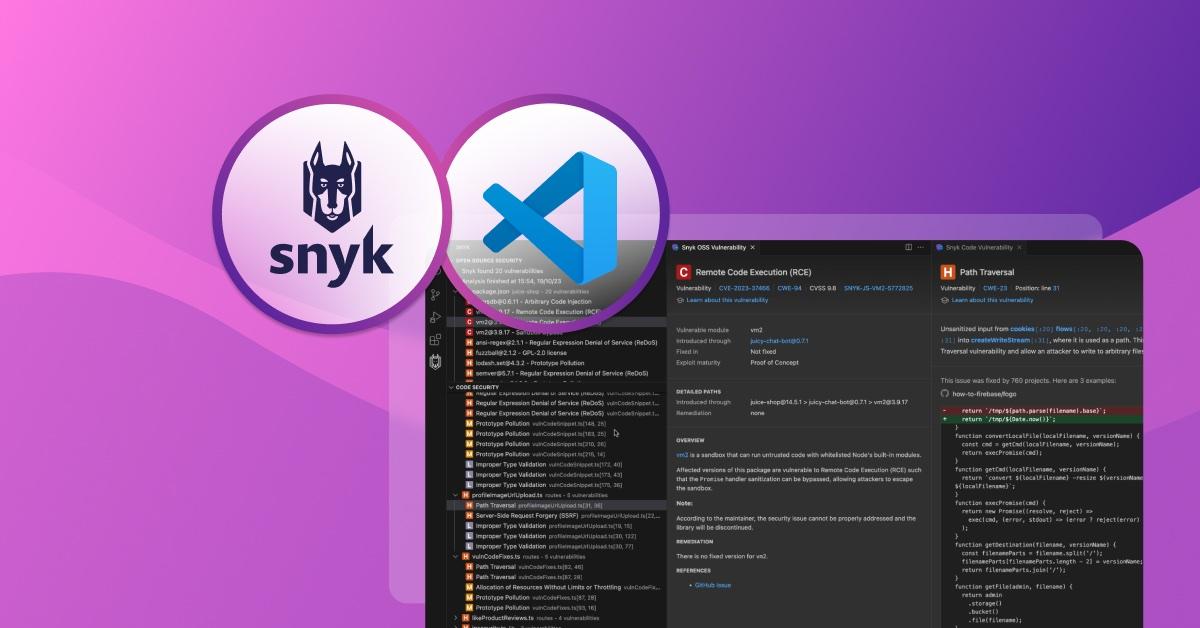
As we started progressing with the early versions of our extension, we encountered numerous obstacles along the way. For instance, each IDE vendor has their own UI design guidelines, but they weren’t always clear or well documented. On the Snyk side, we have one plugin that surfaces many different types of security results, plus an increasing number of developer-focused features that we want to include. We slowly accumulated some development debt in various areas: usability, vulnerability data, layout, and design.
Fast forward to the present: the VS Code development landscape is different, with great design guidelines and helpful resources, not to mention the learning experience provided by ChatGPT. I also became more comfortable with VS Code extension development and decided to fix several issues within our extension based on feedback from our customers, including our own internal use of these tools:
Snyk Code vulnerabilities didn’t have a proper title (naming consistency & cognitive load)
inconsistent layout and vulnerabilities data (cognitive load)
lack of adaptability to the current IDE theme (visual noise)
lack of UI delight
This is how I tackled those issues as a Snyk product designer.
Spacing and visual hierarchy
One of the most underrated design elements is space. It can turn chaotic layouts into well-organized, easy-to-use interfaces. Properly aligning all user interface elements provides a more readable and clear structure for our vulnerability information. We defined an 8px base unit for spacing and applied different multipliers depending on the content.

Different Snyk products, shared layout
Another aspect that we wanted to fix was the layout inconsistencies between the Snyk Open Source and Snyk Code panels, and also differences in how we display this data in other Snyk interfaces. To address that discrepancy, we updated Snyk Code details with the additional information and created a similar header section that is now shared across multiple environments: web app, IDE, and CLI.
Reducing custom code
To ensure the IDE extension is well rendered regardless of the IDE's theme (dark/light), we removed many hardcoded colors and instead used out-of-the-box colors. For instance, the markers from a Snyk Code description initially had different hard-coded colors relative to the vulnerability severity, which mapped to Snyk’s design guidelines for our own UI; but in an IDE where themes are an important matter of personal preference, these colors didn’t always provide the right visual cues. Instead of that approach, the rendered markers now use the CSS color variable and follow the theme’s customizations:
color: var(--vscode-textLink-foreground)In this way, regardless of the preferred theme, the extension will nicely fit in.
Adhering to the VS Code design system
The vulnerability data is complex. It comes in different forms: text content, code snippets, lists, tables, and other elements. Some elements were directly accessible in the code, while others were ingested without direct control.

Considering these constraints, we designed the UI to fit the same aesthetics as the IDE. The typography followed the VS Code's style; the buttons used the same outline icons and hover effects. These changes will reduce the cognitive load and make our extension look familiar.
Final subtle touches
To bring everything together and polish the look of the extension even further, we added our product icon for each custom panel. Not only does it make the overall design stand out, but it also adds a bit of visual identity to the extension.
We aim to provide a seamless experience for improving your code's security posture. Hopefully, you will enjoy these changes and continue sending us feedback and suggestions.


